LA NUIT DES BIBLIOTHÈQUES

LA NUIT DES BIBLIOTHÈQUES


Client:
Fictional (Diploma Project)

Year:
June 2024

Creating a striking and adaptable visual identity for “La Nuit des Bibliothèques,” an event celebrating reading, culture, and discovery


Organized by the city of Geneva, La Nuit des Bibliothèques is a fictional event created for my diploma project. Imagined as a night where libraries extend their opening hours late into the evening, it features conferences, workshops, performances, concerts, and exhibitions. The project aims to reframe libraries as dynamic and welcoming cultural spaces. My role was to develop a strong visual identity and communication strategy for this first imagined edition.

Client:
Fictional (Diploma Project)

Service:
Brand Identity Design, Poster & Print Design, Website Design

Industry:
Cultural Event

Half dome mountain illuminated by sunset light

The Challenge

The challenge was to craft a design that balanced both the intellectual atmosphere of the event and its festive, energetic nature. The logo and visual elements had to work together across multiple formats, from posters to the website, and appeal to diverse groups of people.

The solution

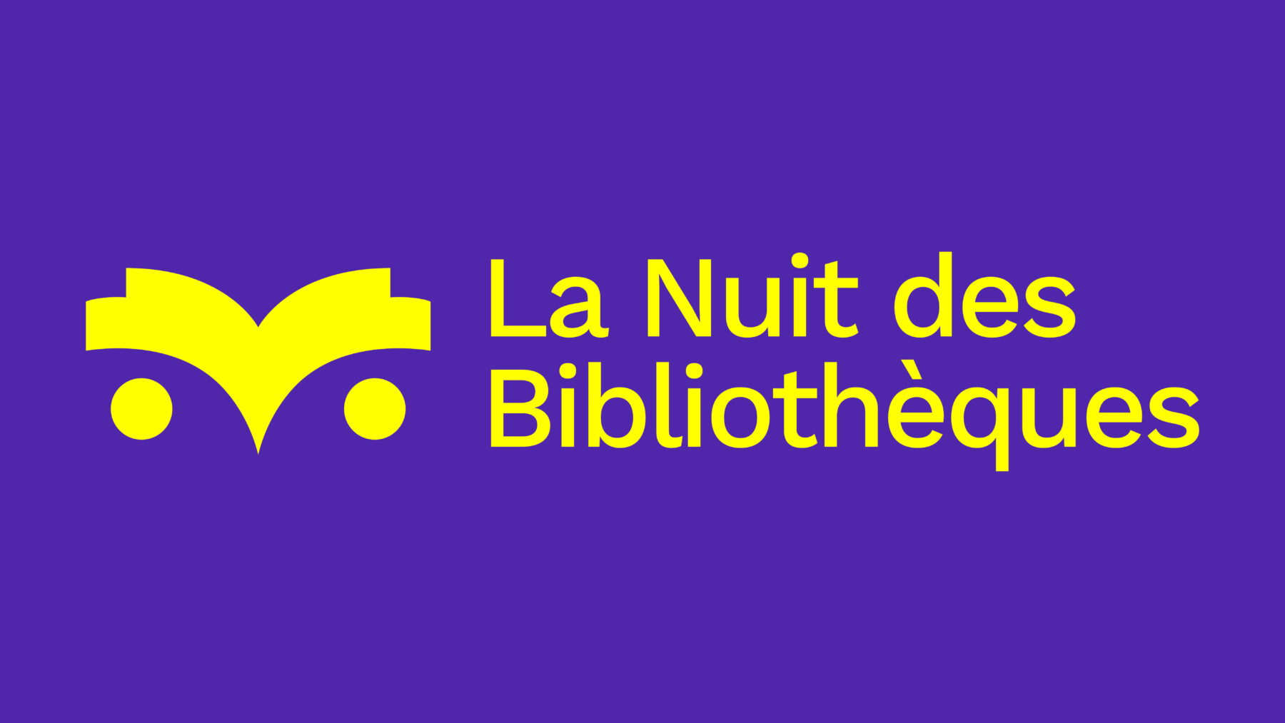
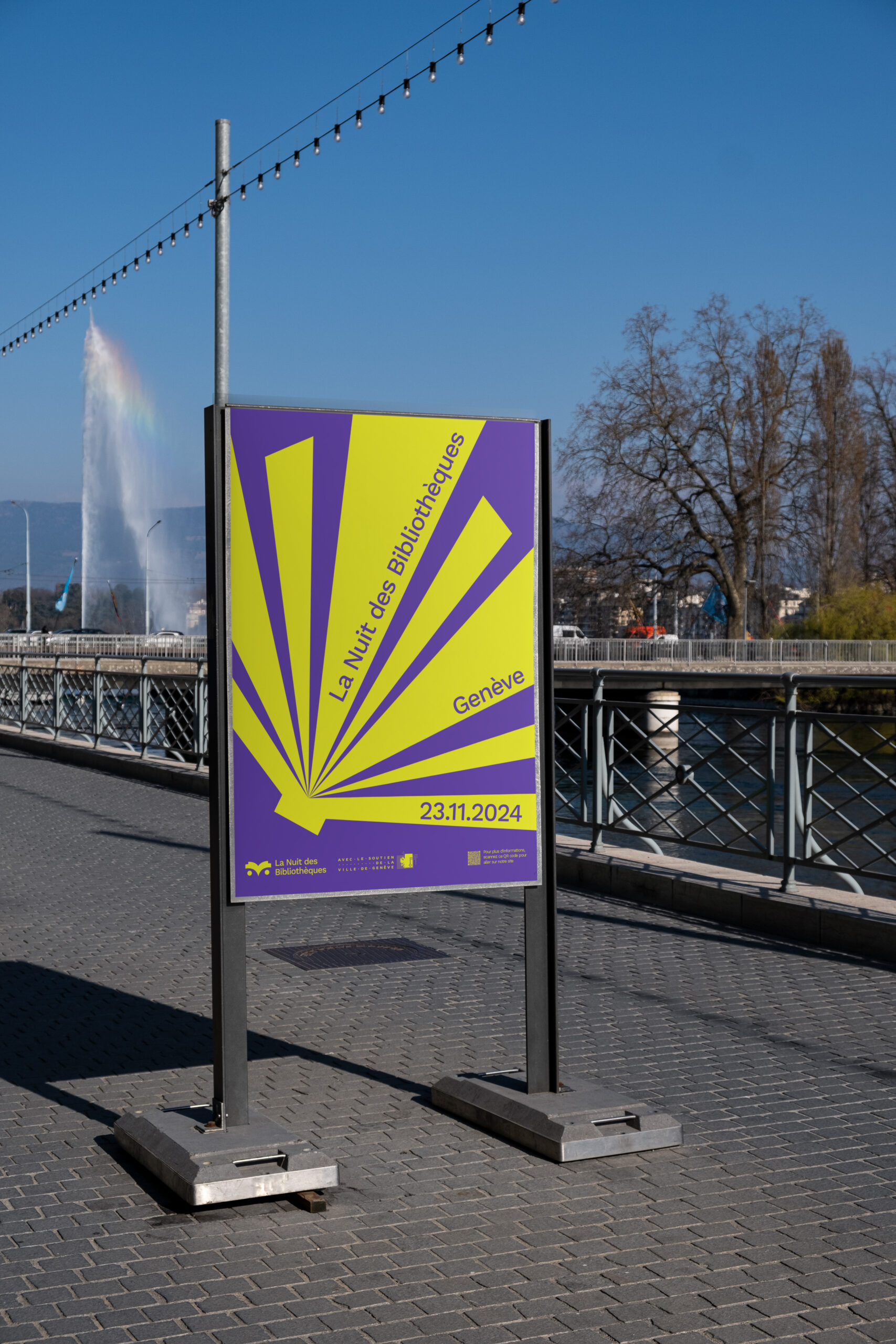
The owl logo symbolizes wisdom and aligns with the event’s nocturnal theme. It serves as the central visual anchor. For the broader visual identity, I incorporated rays that represent the spreading of knowledge, symbolizing movement, energy, and discovery. These rays were used across posters, flyers, and digital materials, creating a sense of excitement and openness.


CHECK OUT SOME MORE


HAVE A PROJECT IN MIND ?

LET’S WORK TOGETHER

get in touch


Footer


Kinetic typography

Kinetic typography


Client:
Class project

Year:
June 2024

Typographic motion pieces exploring untranslatable Filipino concepts

landscape photography of island with boats

This series consists of six monochrome typographic animations, each built around a Filipino word that has no direct one-word translation. Through movement and minimalist composition, the animations explore the emotional and cultural nuance behind these concepts.

Client:
Class project

Service:
Motion Design

Industry:
Typographic Animation

The Challenge

The goal was to represent abstract concepts using only type and motion. The project needed to stay simple, consistent, and clear across all six animations.

The solution

Each word is interpreted through basic typographic movement and controlled pacing. The monochrome palette and square format keep the series uniform.
The result is a straightforward set of animations that explain the meaning of each term through motion.


CHECK OUT SOME MORE


HAVE A PROJECT IN MIND ?

LET’S WORK TOGETHER

get in touch


Footer


Alon ng buhay

Alon ng buhay


Client:
Class project

Year:
April 2025

A 16-page editorial piece connecting personal memories with two places: Lake Geneva and the Philippines.


The book brings together family stories, memories, and landscapes tied to these two locations. It combines photography, short texts, and simple layouts to reflect a personal link to both places.

Client:
Self-initiated

Service:
Printed publication

Industry:
Editorial Design

The Challenge

The layout uses a mix of Latin typography and Baybayin script to show cultural roots in a direct way. A simple design approach, light imagery, and open spacing help maintain clarity.The result is a straightforward printed edition that reflects a personal relationship to place and heritage.

The solution

The layout uses a mix of Latin typography and Baybayin script to show cultural roots in a direct way. A simple design approach, light imagery, and open spacing help maintain clarity.The result is a straightforward printed edition that reflects a personal relationship to place and heritage.


CHECK OUT SOME MORE


HAVE A PROJECT IN MIND ?

LET’S WORK TOGETHER

get in touch


Footer


A love letter to Palestine

A love letter to Palestine


Client:
Class project

Year:
May 2025

A 48-page catalogue centered on contemporary and historical Palestinian art and writing.


The book brings together texts by Saint Levant, Fady Joudah, May Ziadah, and Ibrahim Tuqan. Through their words, the project addresses themes of exile, memory, and identity. The format takes inspiration from personal letters to create an intimate reading experience.

Client:
Class project

Service:
Printed publication

Industry:
Editorial Design

The Challenge

The goal was to design a clear and respectful publication around sensitive content. It needed to present different voices in a consistent structure while keeping the tone personal and accessible. Balancing text-heavy pages with a simple visual approach was also important.

The solution

The layout uses a light, restrained design to keep the focus on the writings. The letter-like format and Coptic binding reinforce the idea of personal correspondence.
The result is a straightforward printed catalogue that offers a calm and intimate view of the Palestinian art and literary scene.


CHECK OUT SOME MORE


HAVE A PROJECT IN MIND ?

LET’S WORK TOGETHER

get in touch


Footer


Animated postcards


Creation of two postcards combining printed imagery with augmented reality animation. Each visual is paired with a short message : “Just go with the flow” and “Life finds a way ; trust you will bloom too.” The animation is triggered through the Artivive app.

Retroverse festival


Design and development of a website for Retroverse, a fictional festival dedicated to retrogaming and 80s–90s pop culture. Created a responsive one-page website coded in HTML and CSS, featuring a full-screen slider, festival presentation, news grid, and partner section.

Les murmures en soi


Personal collection of poems exploring themes of doubt, calm, and the search for balance. The texts are accompanied by typographic compositions, used as a means of visual expression and poetic extension.

Paléo festival


Visual identity proposal for the 2026 edition of Paléo Festival, Switzerland’s largest open-air festival. Inspired by the motto “Le grand frisson collectif, ” the design translates the energy of collective excitement into a dynamic typographic system and graphic wave motifs, applied across posters, banners, stage design, and merchandise.