Kinetic typography
Client:
Class project
Year:
June 2024
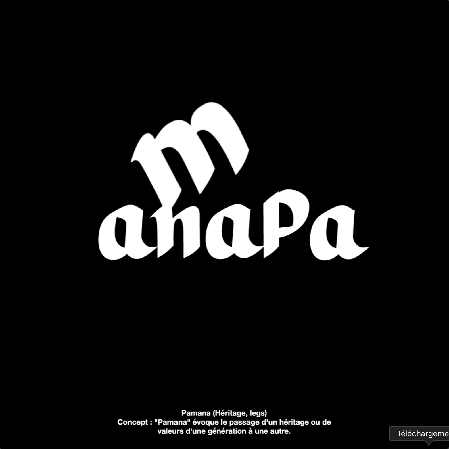
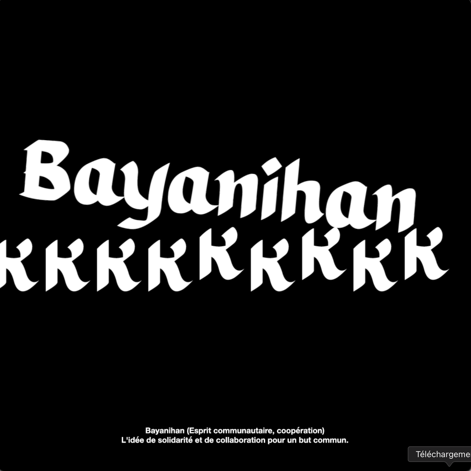
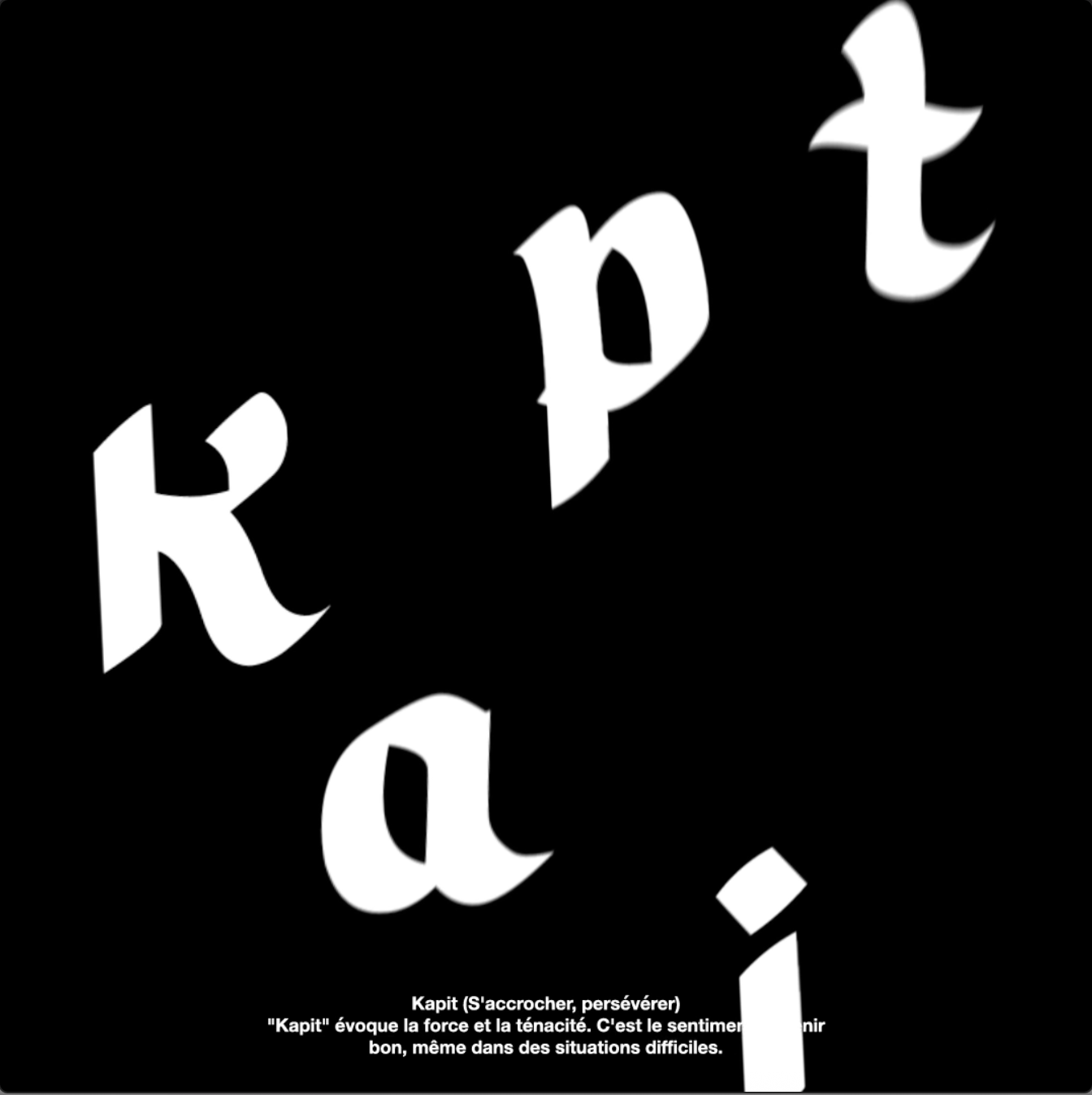
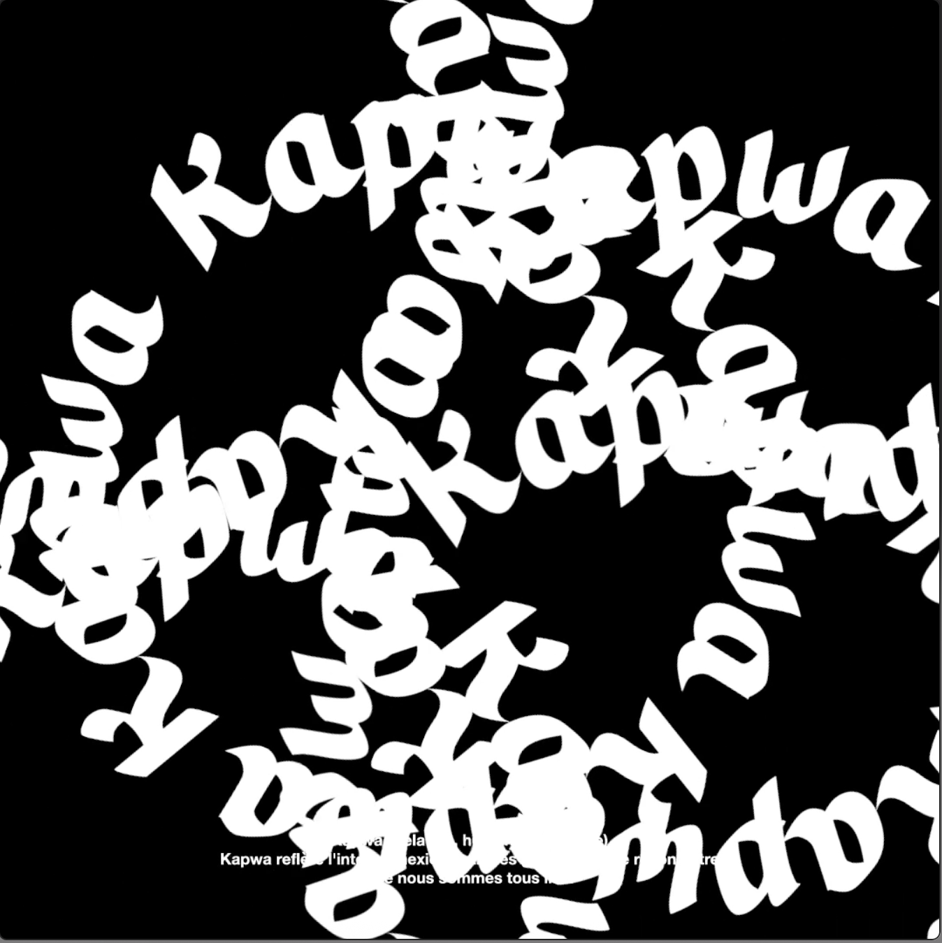
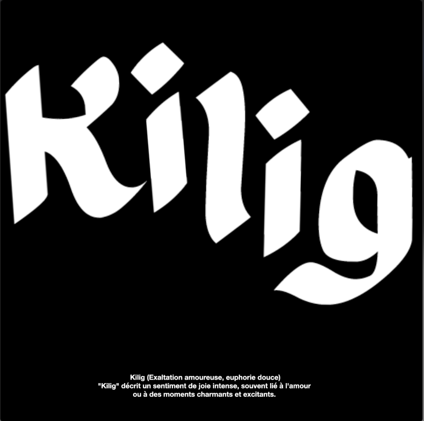
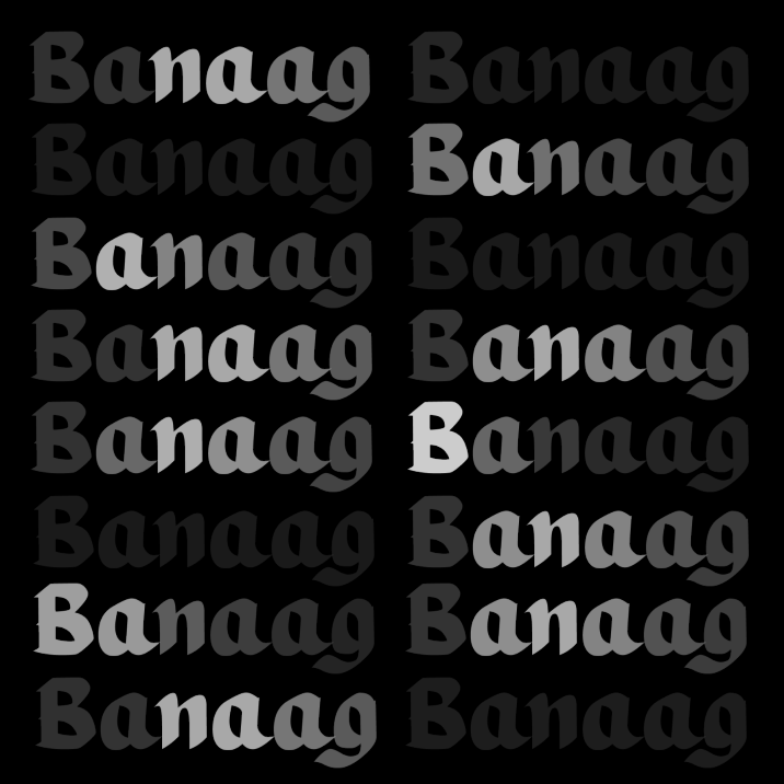
Typographic motion pieces exploring untranslatable Filipino concepts

This series consists of six monochrome typographic animations, each built around a Filipino word that has no direct one-word translation. Through movement and minimalist composition, the animations explore the emotional and cultural nuance behind these concepts.
Client:
Class project
Service:
Motion Design
Industry:
Typographic Animation
The Challenge
The goal was to represent abstract concepts using only type and motion. The project needed to stay simple, consistent, and clear across all six animations.
The solution
Each word is interpreted through basic typographic movement and controlled pacing. The monochrome palette and square format keep the series uniform.
The result is a straightforward set of animations that explain the meaning of each term through motion.
CHECK OUT SOME MORE
HAVE A PROJECT IN MIND ?
LET’S WORK TOGETHER
get in touch
Footer